
Friday, December 17, 2010
My final project
Thursday, December 16, 2010


Friday, November 12, 2010
Anthony Marchetti's Photos


I’m not quite sure what it is about these two photos. But there is something about each that is really intriguing to me and I cant pin point what it is. Both photos are super plain and simple. It gives off a really “empty feeling” vibe. Borderline lonely too. I feel like he could be a photographer for a real estate company. He can make even the simple things of the house look good. I think it would help bring people to view a house if they seen his photos. I also checked out more of his work (anthonymarchetti.com) and the rest looks great also. There are a few really cool “artsy” photos as well as plain and simple ones that look great. Check it out if you get a moment.
Here are a few other shots that i thought were pretty cool
Thursday, October 14, 2010
Metaphors
What the talk about in the book is very true. I never really thought of things like that before when thinking about arguing or talking about money. But now when I look back on it, those things all tie together. I also agree how some of the time its only true for our country. Other people see time as a different thing than us and they have different things tie together than we do.
Thursday, October 7, 2010
My Business Card

Copy #1

Copy #2
I have the more simple card on top, but I kind of like the 2nd card with more smoke. I like them both but couldnt decide on only one.
The artist statement I found
This artist statement is by Nik Ainley. His statement talks a little bit about photoshop (because it is the photoshop spotlight) but the majority of it is still inspiring. His work is insanely good I incourage you to check it out, he has some of his work on this page and also at shinybinary.com
http://www.photoshop.com/spotlights/nik-ainley
http://www.photoshop.com/spotlights/nik-ainley
15 Artists
Friends (Do not have websites, but facebook instead)
1. Jesse Guzik-The way he takes photos and edits them in photoshop is very unique, unlike anyone else's photos I've seen.
2. Jessica Beaumont-She has a lot of feelings in her drawings/paintings, sometimes loud and upfront, but other times hidden inside the drawing.
3.Laura Velasco-Influencial portraits and drawings that express people's feelings.
4.Karrah Kobus-Very different style of photography, use of many different layers giving it an older feel.
5.Bill Hickey(Hickeyphotography.com)-Very good action shots of my favorite sports.
Deviant Art (All artists under this were found at deviantart.com)
6. John De Bord-Great landscape photos.
7. Adam Dobrovits-Very crisp photos, also fall colors.
8. Leszek Bujnowski-Good photoshop skills.
9. Anja Buhrer-Good photoshop skills on real photos.
10. Myrna Y. Jacobs-Awesome darkroom photo skills.
11. Charles Winburn-Knows his camera settings well, tilt, macro, shift, shutter, etc.
12. Cody-Great sense of movement in his photos.
Random websites
13. Tylerstableford.com-Good unique angles for photography.
14. Adelldonague.com-Great graphic design layouts!
15. NIK AINLEY/shinybinary.com-By far my favorite photoshop artist. Has a lot of amazing work. Found him originally on the photoshop.com spotlight, but the site I listed is his own site full of work.
Friday, October 1, 2010
Edited movie poster

This is my edited movie poster. All I did was make the cord on the microphone go to the top of the page. Then I also added a layer of black at the bottom and put the text on that so it would stand out more.
Thursday, September 23, 2010
MY movie poster

I chose this poster because it was my own image. I take photos quite a bit and when I looked through mine I seen this one I thought it looked perfect for a movie cover. I wanted to be able to make something that was mine and not have to take a photo from google or etc. I feel that the composure and the way the photo was taken worked well. If this were a "real" movie, it would be about a younger guy becoming a music star.
The process: I started out by removing a few objects in the photo. There was a bench and window corner that i took out. I did this by using the clone stamp and patch tool. I also added a couple objects, the headphones on his head and the microphone were added to the photo. For the text, I just used a basic font and added some shadow to it. And for the bottom text I just found a font I thought was most similar to other movie poster fonts. As for the photo itself, I cut the guy's body and the back ground into two different layers. In each layer I adjusted the curves to my liking. I also dealt with the temp, contrast, vibrance, etc. Finally, I added a blank layer on top, filled it with black, then erased it until I got the corners darkened to how I wanted them.
Friday, September 10, 2010
Follow your dreams

I chose the quote "follow your dreams". I think everyone should atleast TRY to follow their dreams because if you dont, you will always wonder what if...Besides, the adventure itself is a pretty fun one. Life is too short to not enjoy so go for it while its here. I chose these fonts because they flow well with the back ground on the mountains, and I also like the "curvi-ness" to them. I dont think a straight edge or real fancy font would work with this, so this font worked pretty well.
Good/Bad Movie Posters

I think this movie poster is a great one. The images are really interesting and pulls my eyes into the poster. I also like a lot how they have photos of the main characters and also a photo of what the movie is about. I think they did a good job at fading the characters photos and movie image together, with the title being smack in the middle. The colors dont pop out at you too much, but I like the colors for this movie because it gives it a "western" feel and a little bit of an older feel as well. Kind of like Indiana Jones.

I dont particularly care for this movie poster. There arent any vibrant colors or anything that really pops out to my eye. It also doesnt give you a very good hint of what the movie is about. Also the way the body is composed in this image doesnt really flow with the water he's under. Overall I just think this is a really simple, bland kind of poster.
Friday, August 27, 2010
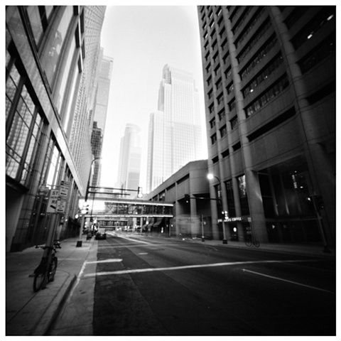
Minnesota is me

The photo I chose is a photo of the minneapolis skyline. The reason I chose this photo is not only because minnesota is my home, but it also represents a lot of other things. Minnesota is full of a lot of different things, people, seasons, places, etc. it applies to myself because I like to experience many of these.
First, it represents me in a way that minnesota is my home and will always be where I grew up. I love all the seasons of minnesota as well. Each season brings something that I like. In the spring, you have everything blooming and I like the fresh air. In the summer, of course we have 10’s of thousands of lakes to spend time on. The fall you have the awesome colors and it starts getting cooler. Last but not least I love winter because I live for snowboarding. Another thing is you have both the city and country. Minneapolis represents me in a way that there is a lot of creativity and art seems to be a big part of the city. I like to be creative. You can drive 30 minutes from the city and be away from everything. Cabins, lakes, and land. I like both city and country. All of these things show why minnesota represents me in a few ways.
Subscribe to:
Posts (Atom)